I recently came across a small usability problem on a very large well known website.
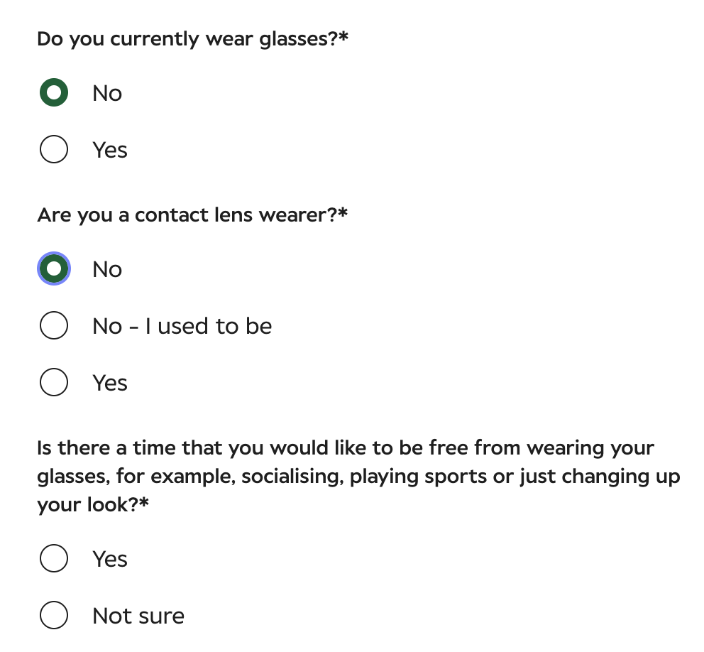
I was trying to complete a form on the Specsavers website for my son, who doesn’t wear glasses, but needed an eyetest. One of the questions asked whether he wears glasses.
So I selected “No’
The next question asked whether he wore contact lenses, with the options “No” and “No – I used to be” and ‘Yes’.
So I selected ‘No’
The next question made absolutely no sense and shouldn’t have been there in the first place. I had selected that he didn’t wear glasses OR contact lenses:
‘Is there a time you would like to be free from wearing your glasses, for example socailising, playing sports or just changing up your look?’
Even more annoyingly, the only 2 options were ‘Yes’ or ‘Not sure.’ I had to choose ‘not sure’, which not only wasn’t true, but means the information being collected isn’t necessarily accurate.
It sounds like a small annoyance,but these are exactly the sort of frustrations that can make a website feel surprisingly difficult to use and mean people drop off forms and don’t use the company whose form it is. In this case Specsavers.
Someone who commented on my semi viral LinkedIn post on the subject pointed out that the wording itself isn’t particularly good either. I’d be tempted to make the question much simpler:
“Would you be interested in trying contact lenses?”
You don’t need to suggest that someone might want to change their look because they wear glasses as lots of people are perfectly happy wearing glasses.
Often, keeping things simple and not overcomplicating them is the best option.
This isn’t about picking on Specsavers – large websites can be very complicated. There are usually different teams involved in designing the experience, collecting information, managing appointments and deciding what happens to the data afterwards.
Therefore, it’s very easy for a small bit of logic to get missed, and it’s why testing a form as a real user is so important.
If you have a form, however large or small your website, the same thinking applies. Take a look at it and think:
- Does this question still make sense based on my previous answer?
- Am I being asked for information I don’t need to provide?
- Are all the answers I might reasonably give available?
- What happens if I don’t know?
- Can I easily correct an answer?
- Does the next step follow logically from what I’ve just told you?
- Are there radio buttons when only 1 answer applies and check buttons when you can select more than one?
A form can look lovely and still be frustrating to use.
Usability is not about whether something works. It’s about whether it makes sense to the person using it.
If you’d like me to take a look and help you improve the usability of your forms, and your website as a whole, I offer affordable website usability audits for £600 + VAT, and mini website usability audits for £200 + VAT.
Get in touch if you’d like to book one or know more – I’d love to help improve how users feel about using your website.